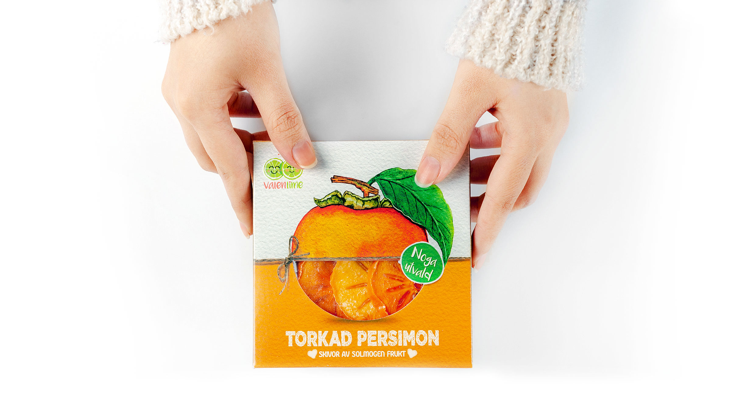
Valenlime, a Swedish nuts and dried fruit producer and supplier, is aiming to substitute these healthy titbites –which are without any sugar or additives- for munchies and other common snacks in the market. Moreover, this brand is trying to fulfill its social responsibilities towards farmers as well as its customer by direct purchasing fresh fruits at the farms. The whole order of Valenlime, a brand originated from the nature, was designing an attracting and lovely packaging which easily could convey the brand’s message; love for nature! For sure you can imagine our enthusiasm toward this project at the moment we have received it. Expressing all these feelings of health and love in just a package. We have faced a tricky challenge about showing the feelings properly. Therefore, we started by the structure. At this level we have made an effort to use the best material, as well as minimization of plastic use to lessen damage of nature.
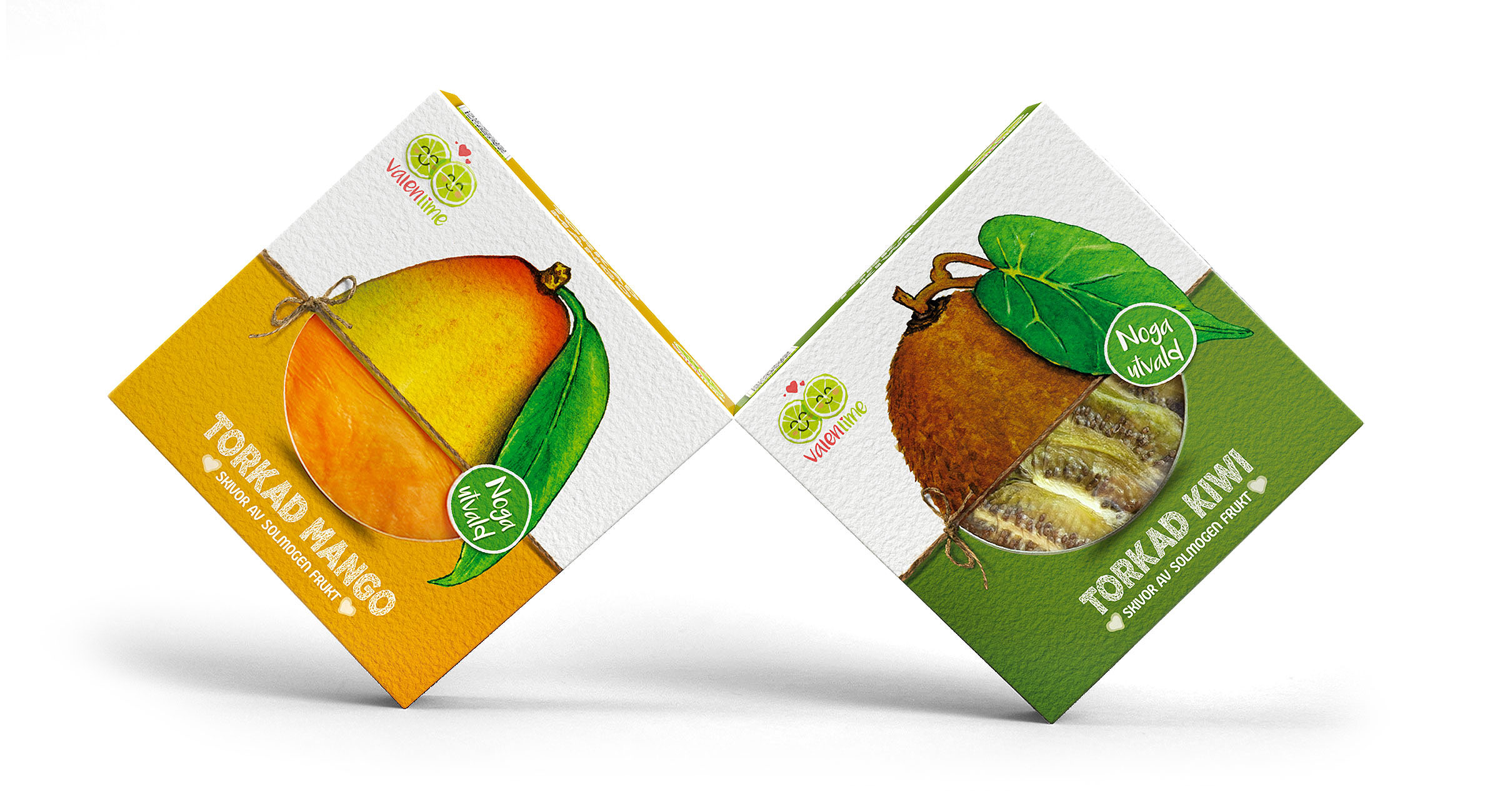
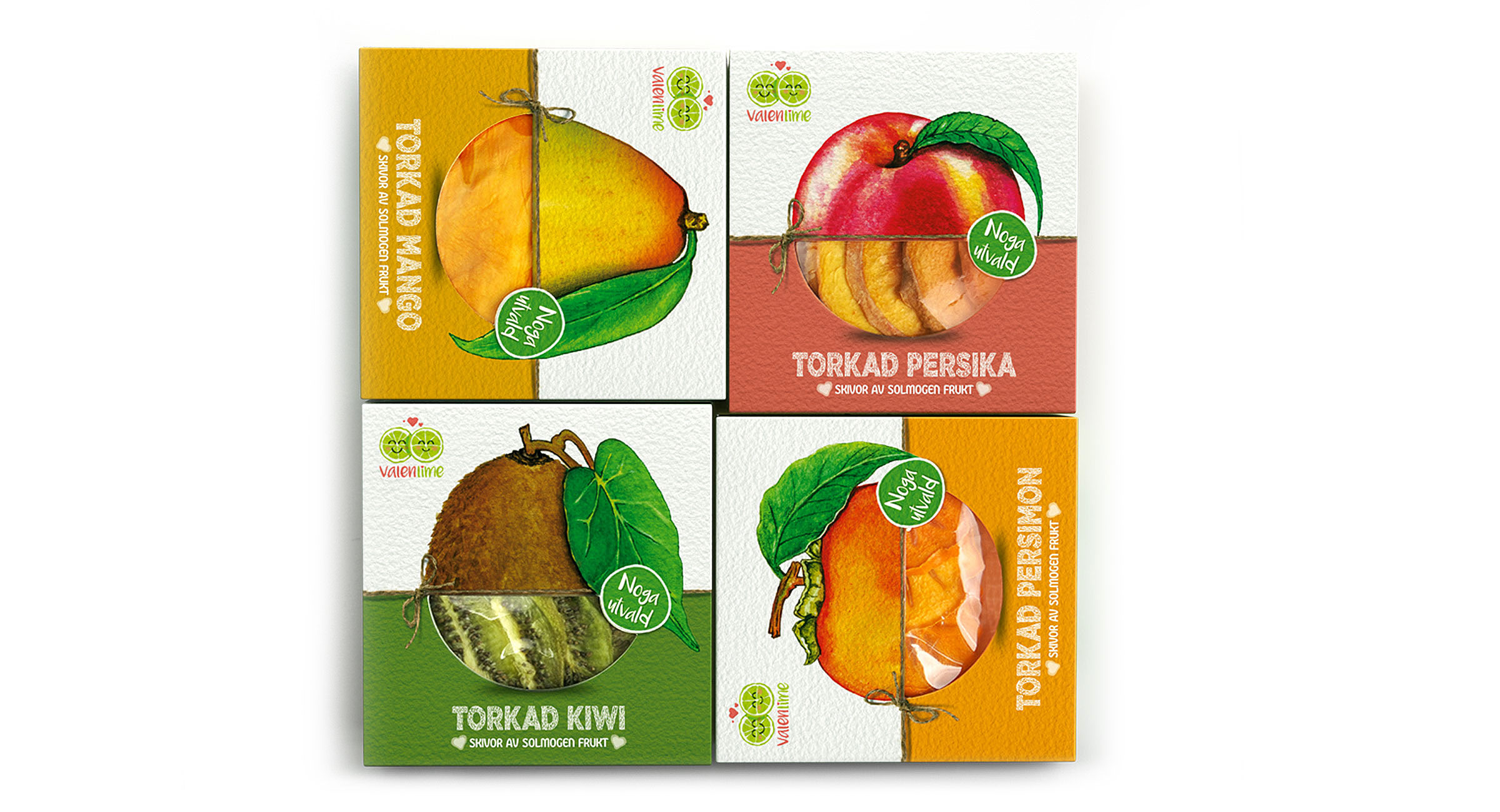
The other critical point which has been considered in this design is transportation. By precise calculation and several trials and errors, we came up with a dimension for the package, not only convenient for the costumer but also let maximum usage of container capacity in each transfer; which means Carbon footprint mitigation and less destruction of nature. However, the next challenge was accurate conveying of the brand’s message to its customers. After too much research, we realized that the answer is not that much complicated; it lies in nature! Using bright ecoline color, the illustration of the fruits have substituted for their pictures to make it more pleasant and inviting. In addition, we need a display window on the package, which has been provided by combining the fruit illustrations with a transparent part showing real dried fruits inside the package to induce the natural origin of the product. The hemp thread in the border of illustration and transparent part, symbolizes tying the image to the reality.
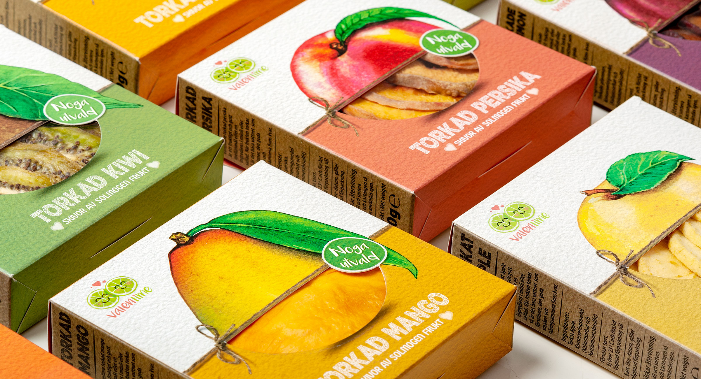
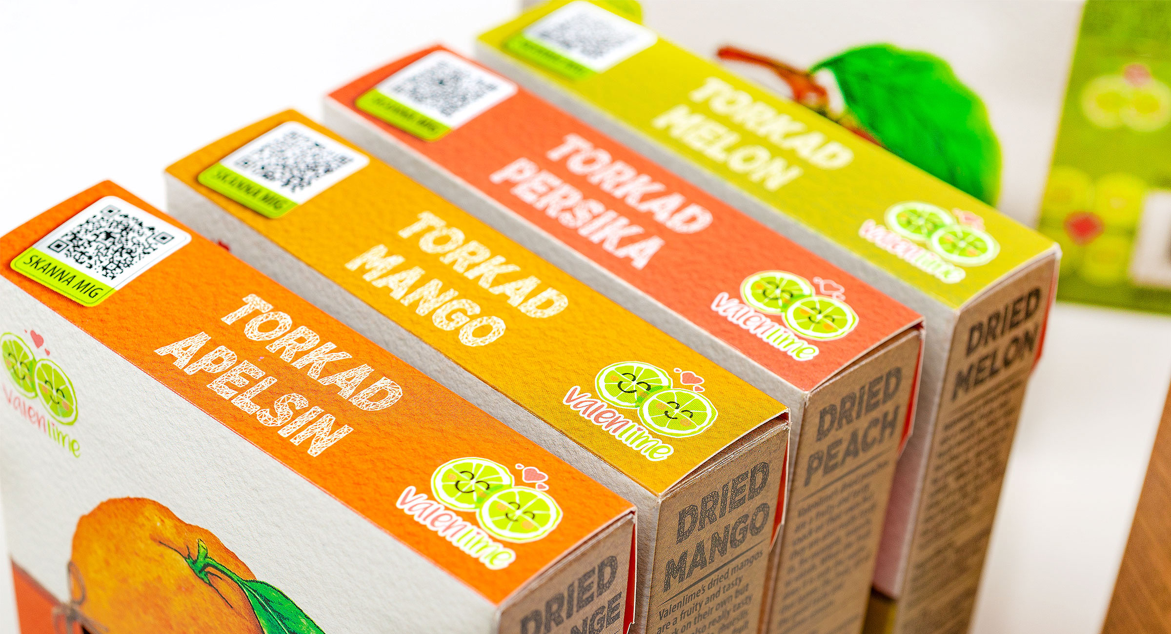
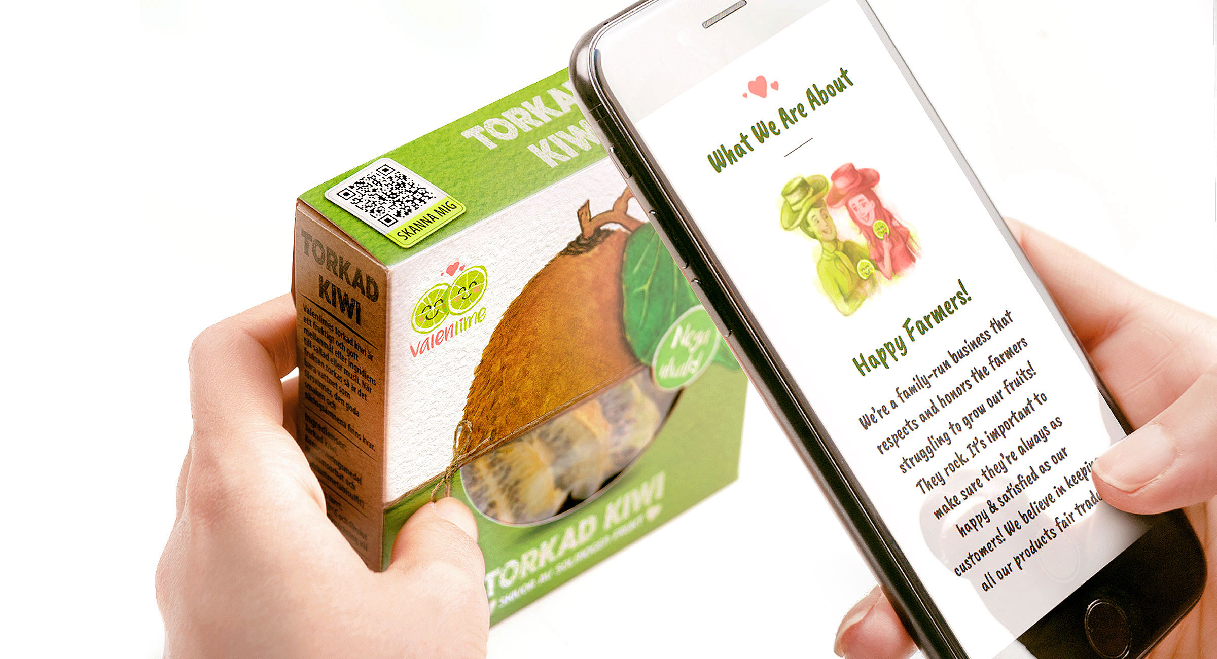
Using some other details such as paper’s texture and Valenlime logo – two happy lover limes- in the package design, we have tried to express great sense of love and intimacy. Furthermore, we placed a QR code on the upper part of the package to invite the consumers to Valenlime’s lovely world where they can listen to Valenlime love story. The love adventure would be completed when you open up the box and find a note written with love, using pink heart pattern, to immerse you in happiness while using the product. But it was not the end! Choosing sharp colors with highest contrast, made the product stand out on the store shelves. Putting these little colorful packages together could make an eye-catching rainbow on the shelves.
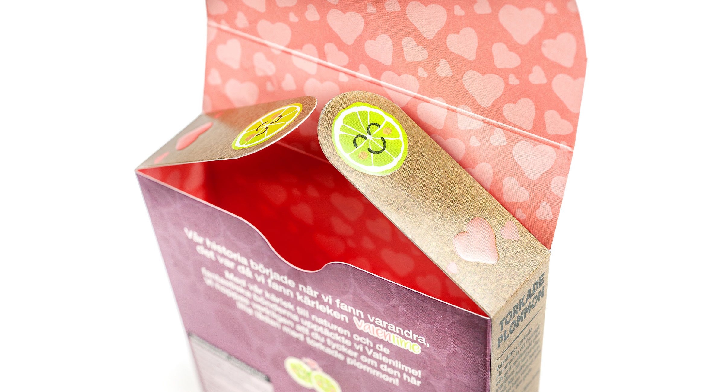
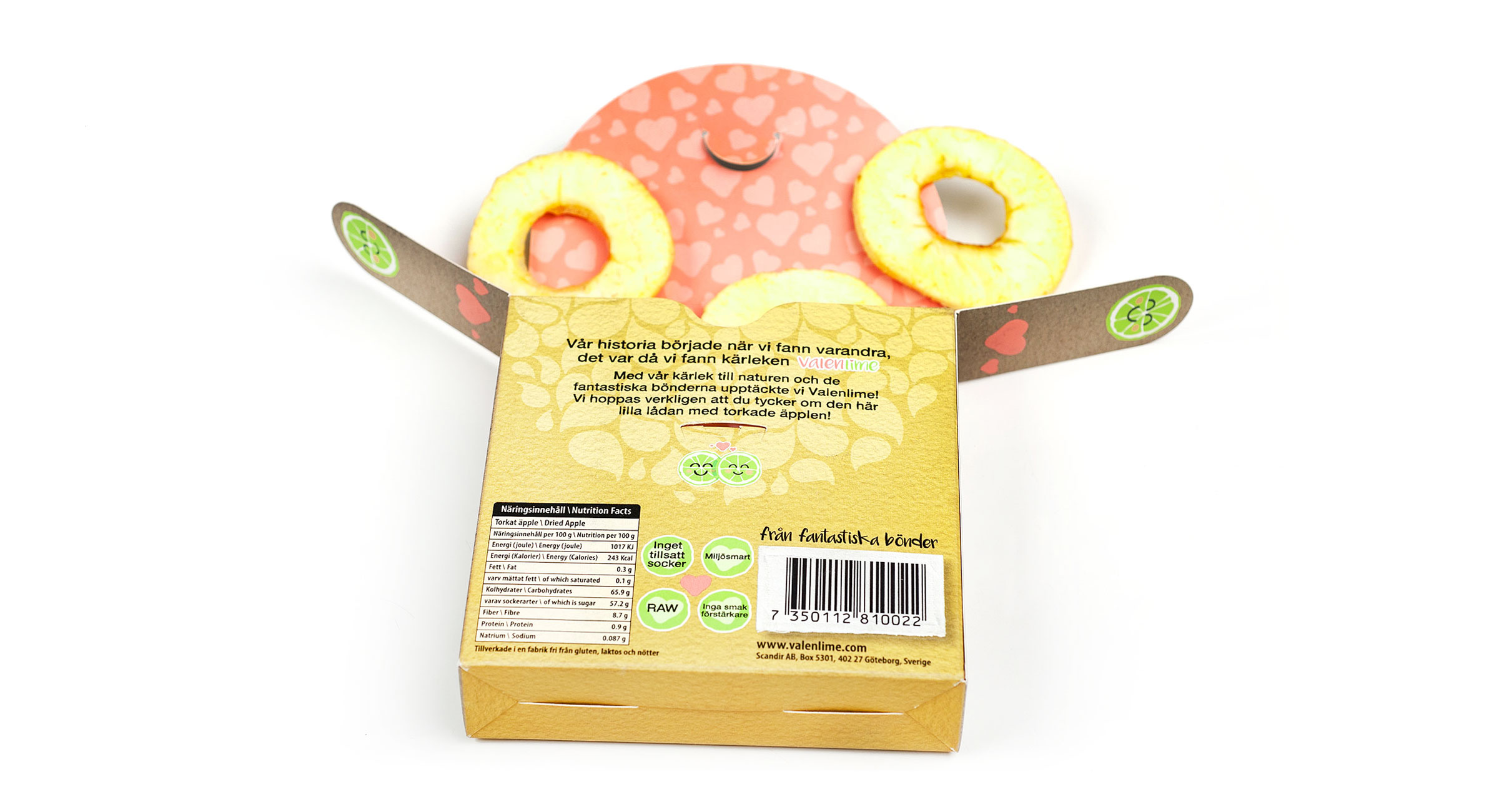
When it comes to brands’ connection, our creation, consists of all colorful details, illustrations, patterns, etc. is strongly able to provide a friendly atmosphere between the brand and its audience.
The post Valenlime | 2018 appeared first on Wallrus .